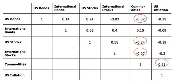
 Correlation Matrix refers to the departure of two random variables from independence. There are several coefficients, measuring the degree of correlation, adapted to the nature of the data. The following illustration is a commodities correlation matrix.
Tuesday, December 2, 2008
Correlation Matrix
Correlation Matrix refers to the departure of two random variables from independence. There are several coefficients, measuring the degree of correlation, adapted to the nature of the data. The following illustration is a commodities correlation matrix.Similarity Matrix
 A similarity matrix is a matrix of scores which express the similarity between two data points. The following illustration is an amino acid similarity matrix.
http://mendel.ethz.ch:8080/Server/ServerBooklet/_17545_tabular891.gif
Star Plots
 The star plot is a graphical method of displaying multivariate data. Each star represents a single observation. Star plots are generated in a multi-plot format with many stars on each page and each star representing one observation. Star plots are used to examine the relative values for a single data point and to locate similar points or dissimilar points.
Stem and Leaf Plot
 A stem-and-leaf plot is a display that organizes data to show its shape and distribution. The ones digit and the tens digit and greater of each data item is separated as leaves and stems respectively.
Box Plot

A box plot is a way of graphically depicting groups of numerical data. The box plot shown here shows the fuel economy averages by different country.
Histogram
 A histogram is a graphical display of tabulated frequencies, shown as bars. It shows what proportion of cases fall into each of several categories. The following histogram is of final exam scores and how many students fell into each score range.
Parallel Coordinate Graph
 Parallel coordinate maps are a visual multidimensional coordinate system with applications in the air traffics control, data mining and models of complex systems.
Triangular Plot
 This triangular plot shows the percentage of votes distributed between the Labour, Conservative, and Liberal Democratic parties in an election in the United Kingdom.
Windrose
 A wind rose is used to represent how wind speed and direction are typically distributed at a particular location. The circular format shows the frequency of wind blowing from a particular direction. The spokes relate to the frequency that the wind blows from a particular direction in time.
Climograph
 A climograph depicts the monthly precipitation and temperature for a selected location. This climograph is of Memphis, Tennessee. Precipitation is shown by a bar graph and temperature is shown by a line graph.

Scatterplot
 The following scatter plot uses two variables to represent a relationship between income and experience. The line moves in an upward slope indicating that as experience increases, so does the income.
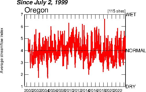
Index Value Plot
 The following index value plot shows the rainfall recorded in inches in Oregon from 1999 until 2006. Four inches of rain fall per years is considered normal and is the base number. Anything above or below four inches is a variance.
http://water.usgs.gov/waterwatch/regplots/real/real_or_2.gif
Lorenz Curve
 A Lorenz curve is used for showing the concentration of ownership of economic quantities such as wealth and income. The following Lorenz Curve shows the distribution of national income among the total population. It shows what percentage of the population the percentages of wealth of distribute to.
Bilateral Graph

This bilateral graph shows the interest rate fluctuations of 30 year fixed and jumbo mortgages in California for a one year period between 2007 and 2008.
Nominal Area Choropleth Map

The following Nominal Area Choropleth Map of the United States presidential election in 2008 shows only which parties nominee won the state. It give not other information on popular or electoral vote result. Republicans are represented in red, and the Democrats are represented in blue.
Unstandardized Choropleth Maps
 An Unstandardized Choropleth Map does not show a specific number o ranking in relation to the variables. This Unstandardized Choropleth Map shows only which minority has the largest percentage of population in each state in the U.S.
Standardized Choropleth Map
 This Standardized Choropleth Map shows the population density of people 14 years of age and younger living in an Canada and more specifically in a particular area in Canada.
Univariate Choropleth Map
 A Univariate Choropleth maps show only a single variable of data. This map shows the percentage of individuals that live in poverty across the United States.
Bivariate Choropleth Map
 Bivariate choropleth maps use two variables on a map by using graphic symbols or colors. The map here shows the change in population density in Russia’s Central Federal District in 2002 and the rate of change in population density from 1989-2002.
Unclassed Choropleth Map
 This unclassed choropleth map show the amount of total vegetables harvested per acre across the United States. Areas in Washington, Florida and California represented in dark green represent the areas of highest density.
 http://www.nass.usda.gov/research/atlas02/Crops/Vegetables%20and%20Melons%20Harvested/Vegetables,%20Acres%20Harvested%20for%20Sale-choropleth%20map.gif
Classed Choropleth Map
 The following map is a choropleth map that shows the amount of Latino population in each county in Florida. The red areas represent the areas of largest population and those in yellow represent the lowest.
Range Graded Proportional Circle Map
 This Range graded proportional circle map represents the populations of the different countries in Europe. The larger the circle represents the larger population in each country. The key shows how the size of each circle corresponds to the population it represents.
Continuously Variable Proportional Circle Map

This map shows the population size and the proportion of industries that each of the cities shown in Western Germany has. The larger the circle is, the larger the cities population. Then the circles are divided by the type of industry for the area and how large of a presence each has in the area.
http://www.lib.utexas.edu/maps/europe/west_germany_ind_1972.jpg
DOQQ
 A DOQQ is a computer generated image of an aerial photograph. They are produced in either grayscale or color. DOQQ’s are referenced to NAD83 and UTM. This map is a DOQQ of Washington, D.C.
DEM
 A digital elevation model is a digital representation of ground surface, topography or terrain. It can be represented as a raster or as triangular. This map from NOAA is a raster map that shows the topography of the United States East coast.
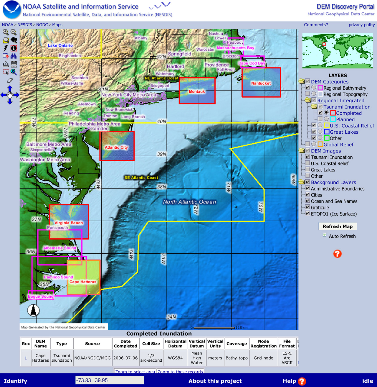
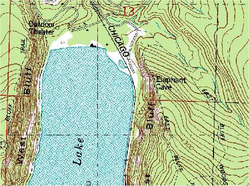
DLG
 A digital line graph is a digital representation of cartographic information from the USGS. They used in PLSS applications and for showing boundaries. This map is a digital line graph of the highway system of Story county in the state of Iowa.
/storyimage.gif)
DRG
 A digital raster graphic is an image scanned of a USGS standard topographical map. The image is geo-referenced and fits to the UTM projection. The data matches the sources map and uses a minimum of 250 DPI resolution.
http://www.forestpal.com/images/drg.gif
Isopleth

Isopleths or contour lines are used in meteorology. They connect different points that that have an equal value of some variable. They are used in map that represent temperature, air pressure, and wind speed.
http://www.jsu.edu/depart/geography/mhill/phygeogone/mappr.jpg
Isopach
 Isopachs are contour lines that are used to show the thickness of rock sediment of a paricular geographic formation on a map. This map of Florida show the thickness of the rock sediment off the coast of Florida in the Gulf of Mexico.
Isohyets
 Isohyets are contour lines drawn on a map to indicate areas of equal amounts of rainfall. The map here shows the distribution and amounts rainfall on the Indian Sub-Continent.
http://www.unu.edu/unupress/unupbooks/80391e/80391E00.GIF
Subscribe to:
Comments (Atom)