 Correlation Matrix refers to the departure of two random variables from independence. There are several coefficients, measuring the degree of correlation, adapted to the nature of the data. The following illustration is a commodities correlation matrix.
Tuesday, December 2, 2008
Correlation Matrix
 Correlation Matrix refers to the departure of two random variables from independence. There are several coefficients, measuring the degree of correlation, adapted to the nature of the data. The following illustration is a commodities correlation matrix.
Similarity Matrix
 A similarity matrix is a matrix of scores which express the similarity between two data points. The following illustration is an amino acid similarity matrix.
http://mendel.ethz.ch:8080/Server/ServerBooklet/_17545_tabular891.gif
Star Plots
 The star plot is a graphical method of displaying multivariate data. Each star represents a single observation. Star plots are generated in a multi-plot format with many stars on each page and each star representing one observation. Star plots are used to examine the relative values for a single data point and to locate similar points or dissimilar points.
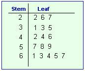
Stem and Leaf Plot
Box Plot
Histogram
Parallel Coordinate Graph
Triangular Plot
Windrose
Climograph
Scatterplot
Index Value Plot
 The following index value plot shows the rainfall recorded in inches in Oregon from 1999 until 2006. Four inches of rain fall per years is considered normal and is the base number. Anything above or below four inches is a variance.
http://water.usgs.gov/waterwatch/regplots/real/real_or_2.gif
Lorenz Curve
Bilateral Graph
Nominal Area Choropleth Map
Unstandardized Choropleth Maps
Standardized Choropleth Map
Univariate Choropleth Map
Bivariate Choropleth Map
Unclassed Choropleth Map
 This unclassed choropleth map show the amount of total vegetables harvested per acre across the United States. Areas in Washington, Florida and California represented in dark green represent the areas of highest density.
 http://www.nass.usda.gov/research/atlas02/Crops/Vegetables%20and%20Melons%20Harvested/Vegetables,%20Acres%20Harvested%20for%20Sale-choropleth%20map.gif
Classed Choropleth Map
Range Graded Proportional Circle Map
Continuously Variable Proportional Circle Map

This map shows the population size and the proportion of industries that each of the cities shown in Western Germany has. The larger the circle is, the larger the cities population. Then the circles are divided by the type of industry for the area and how large of a presence each has in the area.
http://www.lib.utexas.edu/maps/europe/west_germany_ind_1972.jpg
DOQQ
DEM
DLG
DRG
 A digital raster graphic is an image scanned of a USGS standard topographical map. The image is geo-referenced and fits to the UTM projection. The data matches the sources map and uses a minimum of 250 DPI resolution.
http://www.forestpal.com/images/drg.gif
Isopleth

Isopleths or contour lines are used in meteorology. They connect different points that that have an equal value of some variable. They are used in map that represent temperature, air pressure, and wind speed.
http://www.jsu.edu/depart/geography/mhill/phygeogone/mappr.jpg
Isopach
Isohyets
 Isohyets are contour lines drawn on a map to indicate areas of equal amounts of rainfall. The map here shows the distribution and amounts rainfall on the Indian Sub-Continent.
http://www.unu.edu/unupress/unupbooks/80391e/80391E00.GIF
Subscribe to:
Posts (Atom)


